-
OFFICE ON WOMEN'S HEALTH
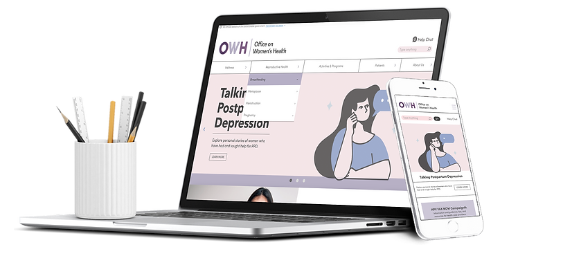
A more efficient, simpler, and modern Office of Women's Health (OWH) website. With a clearer and better-organized Information Architecture, the new OWH website boasts improved intuitive usability and a more effective navigation system.
Skills:
Branding, Visual Design, Prototype
Tools:
Figma, FigJam, Illustrator, Photoshop
Role:
UX Designer, Visual Designer
Team Size:
Individual

The Problem
Users face challenges navigating the Office of Women's Health website due to overwhelming content, making it difficult to find specific health information, locate health centers, and access programs, further hindered by a lack of visual elements and a clear structure.
After a heuristic evaluation, several usability issues were identified.
-
Lack of consistency in photography
-
Minimal use of iconography
-
Poor aesthetic and minimalism

-
Insufficient recognition
-
Challenges with discoverability
-
Difficulty accessing various areas

The Persona
"...I constantly forgot about my health and general well being..."

The Research
We conduct guerrilla test to five
users with the next objectives:
-
Determine whether they can find specific information without any issues.
-
Find out if users can easily locate programs and webinars on the website.
-
Discover how comfortable users feel while navigating the website.
-
Evaluate the effectiveness of the homepage design and content.
5 Users

Guerrilla Testing
Insights
"There is a lot of text I don't want to read"
Overall pain point
Too Much Text
Testing Results
Discoverality Issues
-
We conduct an open card sorting activity based on the current government website information architecture to spot content patterns, cluster similar items, and assign labels to fresh categories.
-
Through the elimination of redundant navigation elements we developed a more organized and less overwhelming site map.
THE SOLUTION
NOW
A more efficient, simpler, and modern Office of Women's Health (OWH) website. With a clearer and better-organized Information Architecture, the new OWH website boasts improved intuitive usability and a more effective navigation system.
Highlights


1.
Navigating through the page content is way easier.
A more efficient, simpler, and modern approach to searching for the desired information throughout the page.

Overwhelming nature of information
Pain Point:
2.
A smarter way to find information about a condition.
The new UI design includes a new way to find information about specific diseases or conditions. The addition of a "Understand Your Condition" page with a user-friendly search bar replaces the outdated and overwhelming system.

Difficulty in locating specific topics or health conditions
Pain Point:

3.
Activities and programs are now in the navigation bar.
The "Activities and Programs" section was challenging to locate, despite being a key offering from the Office on Women's Health.
Pain Point:
Lack of clarity regarding programs and activities
4.
Better imagery,
illustrations, and
simple animations added.
The new website showcases a refreshed brand, boasting an alluring, minimalist, and modern design with the addition of abstract and contemporary illustrations. The enhanced animations contribute to an enriched user experience.


The Style Tile
A clearer and more modern voice that enhances the visual brand, providing a smoother web experience. Also, we decide to create a new logo that better matches the logos of the HHS.gov offices.

Hi-Fi Prototypes

Usability Test
Objectives:
-
Determine whether the desired information is now more accessible.
-
Evaluate if the overall design and content appear less overwhelming.
-
Find out if the new navigation system and AI is more straightforward and well-organized.
-
Discovering if locating programs and activities has become notably easier.
-
Evaluate the effectiveness of the call to action area.
5 Users
5 Desktop Test
5 Mobile Test
Although the results of all the tasks were generally satisfactory, users mentioned some areas for improvement that were iterated when developing the Hi-Fi Prototype. The improvement focused on enhancing discoverability in the user journey to breastfeeding. Additionally, we introduced some animations, and the gallery space in the featured topics was optimized by accommodating three elements instead of two.
Results Sumary